Quarterly Review and Outlook: December 2022
A Look Back
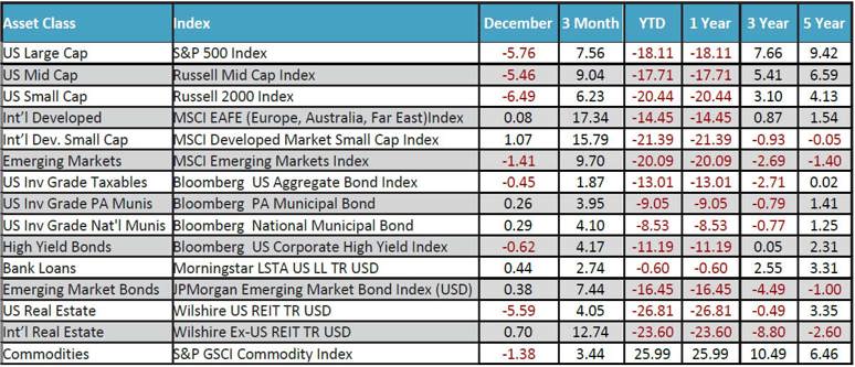
The above song title is a salute to the recently deceased Christy McVie, longtime member of the band Fleetwood Mac. Over the years, Christie didn’t take nearly the press and spotlight as other band members like Stevie Nicks and Mick Fleetwood, but she was quietly the soul of the band as she wrote or co-wrote many of the band’s hit songs. They included “Don’t Stop” from the 1977 Rumors album. In 2020, Rolling Stone magazine ranked the album the seventh-greatest of all time in its list of the top 500. It has sold over 40 million copies worldwide. The lyrics that seem most appropriate for our purposes are “don’t stop thinking about tomorrow…it’ll be better than before…yesterday’s gone, yesterday’s gone.” We look back at the last quarter, and the historically bad year of 2022, and we will have thoughts on what tomorrow might bring later on. We ended the year on a sour note, as stocks in the U.S. were down across the board. International stocks fared better in the month and in the 4th quarter, reversing the trend of the prior three quarters.
The chart below puts 2022 in perspective as it shows the steep decline in the S&P 500, after making an all-time high on January 3rd. Even still, it ended the year 71% higher than the March 2020 low seen in the beginning stages of Covid.
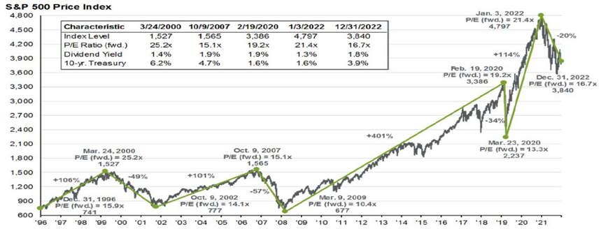
It further illustrates the even steeper rise in the index from the March 2020 low to the Jan 2022 high. We now know that the unprecedented government stimulus and zero-rate policy from the Fed helped drive those returns, and with the benefit of our rear-view mirror, it is not so surprising that a downturn was likely/probable/needed? We show these longer-dated charts because, like many things, perspective is important. In the same way that it prevents us from making less-than-optimal life decisions, it can also help us stay away from untimely investment decisions.
The chart below tells an interesting story spanning the last 15 years. Specifically, it includes the S&P 500 in blue, the Fed Funds rate in red, and the 10-year Treasury in green. Going back to the Great Recession timeframe of 2008-2009, it was really the first time since 1958 that the Fed Funds rate was effectively dropped to zero. We were immersed in an economic disaster the likes of which we had not experienced in decades. The belief was that drastic measures were needed. We tend to side with that take…but that bellwether rate remained at zero for nearly seven years. Although many believed that the Fed kept short-term rates too low for too long, they did start to gradually raise rates in 2016. That continued through the fourth quarter of 2019…and then Covid hit in the beginning of 2020, and brought a return to the zero-rate policy. We know the drivers that have once again changed Fed policy again over the last year. Inflation, while tame over the last couple of decades, soared as a result of concurrent factors that included Covid, supply chain disruptions, the Russia/Ukraine war and more. It is now clearly the main focus of the Fed. On a comparative basis, the drastic rate hikes seen over the last year reminds us of the steps taken in the late 1970’s and early 1980’s as inflation soared to over 13%, and the Fed increased the Fed Funds rate to 20%! The green shaded areas in the chart illustrate the various government stimulus packages that we’ve seen over the last 15 years. Again, many debate the timing and the overall size of stimulus, but few can debate the resulting effect. The Fed balance sheet, which stood at under $1 trillion in 2008, ballooned to $9 trillion in 2022, or over a 9-fold increase. And now…the Fed is attempting to let the air out of that balloon, both with the rate increases and by reducing their bloated balance sheet.
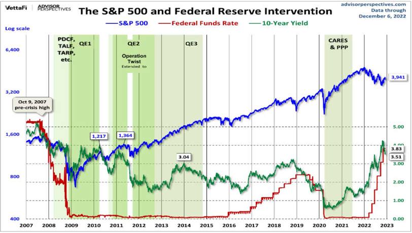
Not surprisingly, the S&P 500 has performed exceedingly well over the last 15 years…even with a rough 2022. The zero or near-zero rate policies that have dominated the period helped springboard the Big-Cap stock index. Acronyms like TINA (There is No Alternative) were born as investors spurned earning nothing on their money markets and CD’s, and instead bought stocks. The strategy is fairly clear. When the economy is suffering, the Fed and our government step in and attempt to incentivize spending. Conversely, when things are running too hot and price increases become problematic, they try to do the reverse…tamp down spending, and in this case, bring inflation back down to their 2-2.5% target.
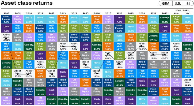
The chart below is a familiar one. It looks at the various major asset classes and how they have performed over time. It also shows a typical diversified balanced allocation highlighted by the white box. We include this illustration because it is a quick, colorful and useful reminder that things change. Yesterday’s loser can, and often are tomorrow’s winner. After being at or near the bottom of performance over the last 10 years, Commodities were the best performing asset class shown…and by quite a bit. It certainly makes sense as supply chain disruptions and the Russia/Ukraine war made various agriculture and precious metal products scarce. Although the case for diversity did not pan out in 2022 as it historically has in the past (stocks and bonds were both negative in 2022) the white box was still in the middle of all asset classes over the entire period, and has delivered a 6.1% annualized performance, which includes last year’s dismal returns. It is so difficult to know exactly when the various zigging and zagging of the asset classes will occur. However, a measured, diversified approach that includes exposure to all or most of these colored boxes works over time.
A Look Forward
It is by far the most pressing question being asked today...what do you see going forward. To answer that, just a quick reminder about how out of the norm 2022 was for stocks and bonds. The box below is scatter plot of a simple 60/40 portfolio allocation since 1977. (60% stocks and 40% bonds). Most of the data is in that upper right hand quadrant, where returns for both are positive. You see that in most years, bonds tend to deliver a positive return, and prior to 2022, the worst year was -2.9%. That red dot is last year. Stocks were down over 18%, while bonds were negative by 13%. Yikes!
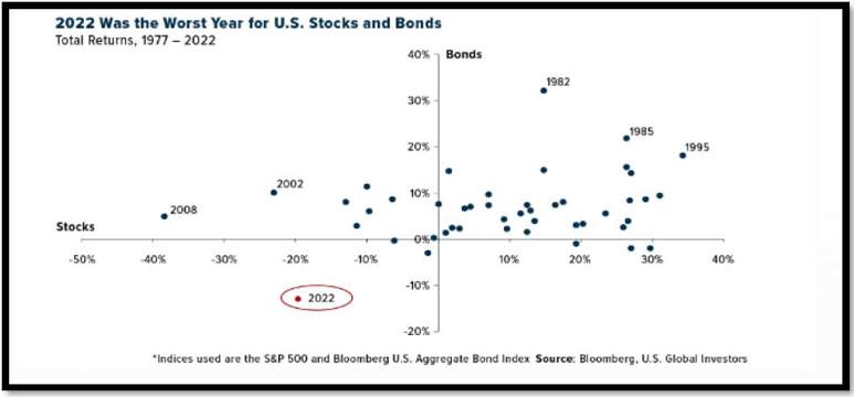
Now we have some additional perspective. Does it mean that we can’t have another year like last year? It does not. Does it mean that is highly unlikely? We believe it is.
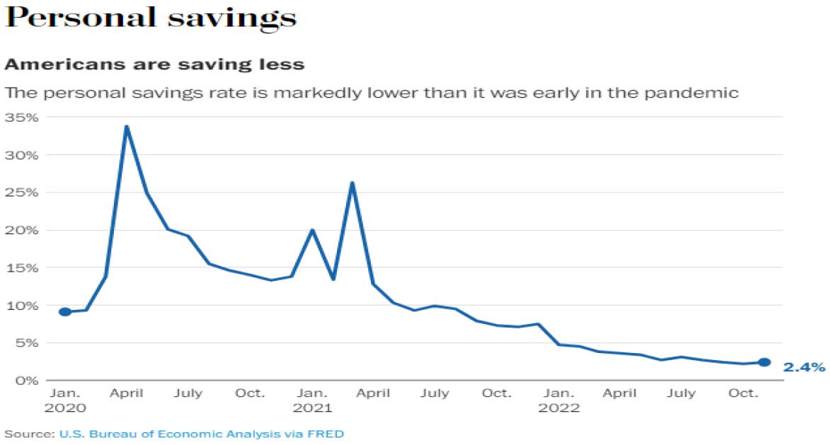
Below is one more chart that tells a story. As the title states, Americans are saving less. Much less. Savings spiked in the early days of the Coronavirus epidemic in 2020 amid global uncertainty. Various stimulus money became available and people did start to spend. But look how it has tailed off since the end of the stimulus. Coupled with higher inflation, many have had to tap into their savings to make ends meet. The current 2.4% level is worrisome, and lower than the 5-10% levels we have seen over the last 12 years. It is likely that rate won’t change drastically until inflation is back in the “normal” range and prices start coming down…and people actually have more to save.
Most readers know that we tend to be more of a glass half-full bunch. We strongly believe in the resiliency of our financial markets and overall health of the best economy in the world here in the U.S. That has not, and certainly does not insulate us from excesses, mistakes, greed, etc. We continue to build a little more conservative portfolio for our clients. We recently increased our cash allocation, as there really is an alternative now. The most recent yield on money markets is now over 4.1%, and reminds many that cash is an asset class, no matter how boring. We also continue to have a tilt toward value stocks, as we believe the grind in the markets may continue as the Fed efforts to get inflation under control. The inflation fight is like many others…In golf, it is fairly easy to go from a 30 handicap to a 20. With inflation, going from the 9.2% level we saw this year to 6%...not so bad. The move from 6% to 5%, and ultimately 2%, might be a little tougher. Tougher is okay. We have seen it before. It would be nice if there was neon sign flashed when the worst was over, but of course that is not the case. We still believe there may be risk left for stocks as we navigate this higher rate/inflation environment. But, with that, comes opportunity. It would not be a surprise for us to be writing about attractiveness of stocks in the not too distant future. For now, we will be fine with being a little more conservative…and we never stop thinking about tomorrow.


